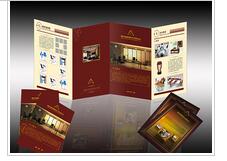
The color treatment of book cover design is an important part of design. Appropriate color expression and artistic treatment can produce eye-catching effect in the reader's vision. The use of color should consider the needs of content, and use different color contrast effects to express different contents and ideas. In contrast to seek unity and coordination, inter color configuration is appropriate, so that the contrast color is unified in the coordination. The color of book title should be used in a certain amount on the cover. If the purity is not enough, it can not produce a remarkable effect. In addition, in addition to painting color used for cover design, can also be used for decorative color performance. The color of the cover design of literature and art books is not necessarily suitable for textbooks, and the cover color of textbooks and theoretical works is not suitable for children's books. We should treat the meaning of color dialectically, not metaphysically.
一般来说设计幼儿刊物的色彩,要针对幼儿娇嫩、单纯、天真、可爱的特点,色调往往处理成高调,减弱各种对比的力度,强调柔和的感觉;女性书刊的色调可以根据女性的特征,选择温柔、妩媚、典雅的色彩系列;体育杂志的色彩则强调刺激、对比、追求色彩的冲击力;而艺术类杂志的色彩就要求具有丰富的内涵,要有深度,切忌轻浮、媚俗;科普书刊的色彩可以强调神秘感;时装杂志的色彩要新潮,富有个性;专 业性学术杂志的色彩要端庄、严肃、高雅,体现感,不宜强调高纯度的色相对比。
Generally speaking, to design the color of children's publications, we should aim at children's delicate, simple, naive and lovely characteristics. The color tone is often treated as high-profile, weakening the strength of various contrasts, and emphasizing the soft feeling. The color of women's publications can choose gentle, charming and elegant color series according to women's characteristics; The colors of sports magazines emphasize stimulation, contrast and pursuit of color impact; the colors of art magazines require rich connotation, depth and avoid frivolity and kitsch; the colors of popular science books and magazines can emphasize mystery; the colors of fashion magazines should be fashionable and full of personality; the colors of popular science books and magazines should be innovative and full of personality; The colors of professional academic magazines should be dignified, serious, elegant, and have a sense of embodiment. It is not appropriate to emphasize the high-purity hue contrast.

色彩配置上除了协调外,还要注意色彩的对比关系,包括色相、纯度、明度对比。封面上没有色相冷暖对比,就会感到缺乏生气;封面上没有明度深浅对比,就会感到沉闷而透不过气来;封面上没有纯度鲜明对比,就会感到古旧和平俗。我们要在封面色彩设计中掌握住明度、纯度、色相的关系,同时用这三者关系去认识和寻找封面上产生弊端的缘由,以便提高色彩修养。
In addition to coordination in color configuration, we should also pay attention to the contrast relationship of colors, including hue, purity and lightness. If there is no color contrast on the cover, you will feel lifeless; if there is no light contrast on the cover, you will feel dull and breathless; if there is no clear contrast on the cover, you will feel archaic and peaceful. We should grasp the relationship of lightness, purity and hue in the cover color design, and use these three relationships to understand and find the causes of the defects on the cover, so as to improve the color cultivation.
不难看出颜色对于封面设计而言非常重要。济南书刊杂志印刷认为要在画册封面设计中选择合适的颜色表现图书主题,或为封面确定某种基本色调,就需要对画册书刊的主题有一定的把握,并对各种颜色的属性有相当的了解。
It's not hard to see that color is very important for cover design. Jinan book and magazine printing thinks that in order to choose the right color to express the theme of the book in the cover design of the picture album, or to determine a certain basic tone for the cover, we need to have a certain grasp of the theme of the picture album, and have a considerable understanding of the attributes of various colors.
声明:文章来源于https://www.sdhzyw.com/