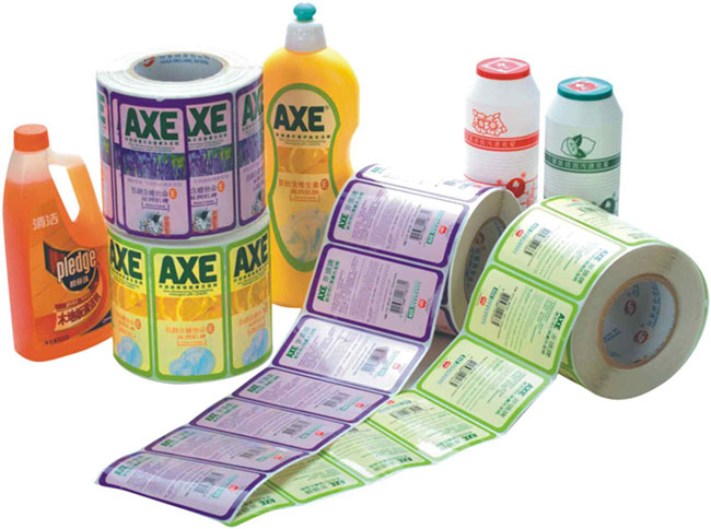
一:色彩的使用,有些编辑凭着自己的喜好罗列一些漂亮的颜色用在版面上,标题、报头、正文都是五颜六色的颜色,色彩运用毫无章法,版面上也没有主色调,翻开报纸有一种在观览各种颜色衣服的感觉,给人的视觉造成疲劳;
1: The use of colors, some editors list some beautiful colors based on their own preferences and use them on the layout. The titles, headlines, and main text are all colorful colors, and the use of colors is disorganized. There is no main color tone on the layout, and opening the newspaper gives a feeling of viewing various colors of clothing in the mall, causing visual fatigue to people;
二:有些报纸的编辑担心色彩搭配不当,版面上除了一些彩色照片外其它地方都不用色彩,因为几张彩色照片不但导致了比较贵的印刷费,而且还违返了办彩报的初衷。通常比较懂的编辑就从不滥用色彩来搭配,只是让报纸的颜色更接近于人们的对报纸所看的目的,正如有位名人所说:“如果你希望使相近的颜色并排而又要美观悦目,请注意组成霓虹的阳光的次序”。
2: Some newspaper editors are concerned about improper color matching, as colors are not used on the page except for some color photos, as a few color photos not only result in expensive printing fees, but also violate the original intention of running color newspapers. Editors who are usually more knowledgeable never misuse colors to match, just to make the colors of the newspaper closer to people's reading purposes. As a famous person said, "If you want similar colors to be side by side and beautiful to the eye, please pay attention to the order of the sunlight that forms the neon.
彩色报纸印刷中统一与变化是编辑美中不变的主题,统一是主要的,形成版面整体感;变化是次要的,避免版面的单调和死板。报纸印刷应有自己的色彩基调,以体现报纸的媒体理念、市场定位及独有的神韵,在读者的视觉心理上产生影响。
Unification and change are the unchanging themes in editorial aesthetics in color newspaper printing, and unity is the main factor, forming a sense of overall layout; Changes are secondary, avoiding monotony and rigidity in the layout. Newspaper printing should have its own color tone to reflect the media concept, market positioning, and unique charm of the newspaper, and have an impact on readers' visual psychology.
版面的整体色彩倾向应据版面的定位、风格以及稿件的内容而定,确定主色调,一般说来,主色调的颜色在版面颜色中应占60%的面积,不然压不住版面,形成不了“主调”。在主调的基础上,还可以配上相邻色系的颜色,给人和谐统一的感受。
The overall color orientation of a layout should be determined based on the positioning, style, and content of the manuscript. Generally speaking, the color of the main color should account for 60% of the layout's color area, otherwise it cannot suppress the layout and form a "main tone". On the basis of the main tone, it can also be paired with adjacent color schemes, giving a harmonious and unified feeling.