一、纸张外表越粗糙,油墨的吸收量就越大。打印纸的粗糙外表,油墨泛滥现象更容易出现。这是因为有些纸张纤维的交织发生的间隙,均匀的涂层还没有很好的覆盖。这种压纹纸和印版时,油墨层外表发生不良接触。如果通过适当的印刷压力,可以有足够的接触时间与油墨层的布局的纸张的平滑性差,实现均匀的压印接触,可以确保印刷墨层均匀平服。
1、 The rougher the paper surface, the greater the ink absorption. The rough surface of printing paper and the overflow of ink are more likely to occur. This is because some paper fibers are interlaced and the uniform coating has not been well covered. When the embossing paper and the printing plate are used, the surface of the ink layer is in bad contact. If the printing pressure is appropriate, there can be enough contact time and the smoothness of the paper with the layout of the ink layer is poor, so as to achieve uniform embossing contact, which can ensure that the printing ink layer is uniform and flat.
二、保守胶合板面前底部支架的印刷版,不只有许多弊端,容易呈现油墨转移不良现象,引起油墨布局不均的发生。这是因为木材的底部托盘不够强,变形的可能性也比较大,导致不稳定的印刷压力,油墨层的布局不能均匀地转印到纸张上。好的方法就是做好备份操作技术,一些印刷板面积较大,应选择一些平整度好,比拟扎实的金属版本的护理,可以更好的防止这些现象的发生。
2、 The printing plate of the bottom bracket in front of the conservative plywood has not only many disadvantages, but also is prone to poor ink transfer, causing uneven ink layout. This is because the bottom tray of wood is not strong enough, and the possibility of deformation is also large, leading to unstable printing pressure, and the layout of the ink layer cannot be uniformly transferred to the paper. A good way is to do a good job in backup operation technology. Some printed boards have a large area, so you should choose some with good flatness, which is comparable to the solid metal version, to better prevent these phenomena.
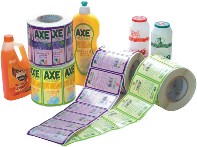
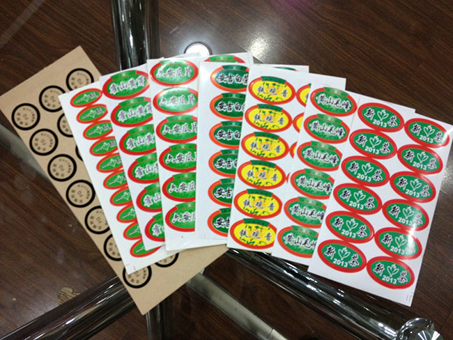
彩色印刷品在设计和叠印的处理上要注意以下六点:
The following six points should be paid attention to in the design and overprint of color prints:
1、字形过小的文字应避免选择笔画太细的字体,比如仿宋体、细圆体等,字体的笔画原本就细,如果字形过小,印刷时笔画就容易丢失,导致字迹不全;
1. For characters with too small font size, avoid choosing fonts with too thin strokes, such as imitation Song typeface and thin round typeface. The strokes of fonts are originally thin. If the font size is too small, the strokes will be easily lost during printing, resulting in incomplete handwriting;
2、尤其是细小的文字,应避免使用多色套印;
2. Especially for small words, multi-color overprint should be avoided;
3、尽量避免使用细小的反白文字;
3. Try to avoid using small inverted words;
4、细小的文字应避免叠印在深色的背景上;
4. Small words should not be overprinted on the dark background;
5、细小的文字应避免使用金墨、银墨印刷,金墨、银墨的颗粒比一般油墨粗,用于印刷细小的文字时,容易导致字迹模糊等问题;
5. The printing of small characters should avoid using gold ink and silver ink. The particles of gold ink and silver ink are thicker than ordinary ink, which may lead to problems such as illegibility when used to print small characters;
6、尽可能采用叠印方式在底色上印文字和图片,而不用在底色版上挖空的方式。
6. As far as possible, use the overprint method to print words and pictures on the background instead of hollowing out the background plate.
在彩色印刷品设计印制时注意这些问题,可防止后面发生很多不必要的浪费,还可呈现给客户精美的印品,何乐而不为呢。
Pay attention to these problems when designing and printing color prints, which can prevent a lot of unnecessary waste later, and also present beautiful prints to customers. Why not.
The above is a detailed introduction of Jinan color design and printing for you. I hope it will be helpful to you. If you have any questions, please contact us. We will provide you with our attitude https://www.sdhzyw.com/